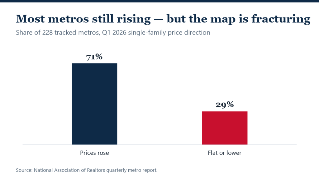
Home prices rose in 71% of the 235 metro areas NAR tracks during the first quarter of 2026 — a comfortable majority that nonetheless marks one of the most fragmented price maps in years, with nearly three in ten metros flat or declining.
The report also refreshed the country’s affordability extremes: San Jose remained the most expensive market in America, with a median single-family price of about $2.03 million — roughly five times the national median.
The first quarter by the map
- Rising: 71% of 235 tracked metros posted annual single-family price gains.
- Flat or falling: nearly 29% — a share that has grown steadily since 2024.
- The ceiling: San Jose led the nation at about $2.03 million.
Reading a 71/29 market honestly
Bulls will note that nearly three-quarters of metros are appreciating; bears, that in a normal year the share of declining metros runs in single digits. Both readings serve agendas — the useful one is geographic. The declines cluster where the pandemic boom and the construction response were largest, while gains persist across the supply-starved Northeast and Midwest — the identical geography in the FHFA’s regional index and Realtor.com’s listing data. Three datasets, three methodologies, one map.
Quarterly metro data also lags — Q1 closings reflect winter contracts — so treat this as the baseline against which June’s record-setting national medians will eventually resolve at metro level. If the spring’s luxury-led strength held, Q2’s map should firm; if not, the 29% club grows.
What it means
For consumers, the report is an argument against national narratives in either direction: nearly a third of markets contradict the headline. Buyers relocating between metros face the sharpest arbitrage in years — selling into a rising Midwest market and buying in a softening Sun Belt one is a genuine wealth transfer. For sellers in the declining 29%, the data recommends the pricing discipline covered in RealtyWire’s slower-market pricing guide — waiting out a supply-driven decline usually costs more than meeting it.
The historical baseline makes the 29% figure meaningful. In a typical appreciation year, the share of metros with falling prices runs in the single digits; during the 2008–2011 bust it approached totality. Nearly a third of metros flat-to-down, while the national median sets records, has little precedent outside of transition periods — which is precisely what the data describes: a market rotating from one price regime to another, metro by metro.
San Jose’s $2.03 million median deserves its asterisk too: at roughly five times the national figure, it means a ‘median’ Bay Area buyer needs an income comfortably in the top few percent nationally. The affordability spread between America’s most and least expensive metros is now wide enough that national affordability statistics describe almost no actual market — a theme Harvard’s housing report quantifies at length.
For agents, the quarterly metro tables are underused competitive equipment: buyers relocating across metro lines — an ever-larger share in a remote-flexible economy — consistently misprice their destination market by anchoring on their origin market. The agent who corrects that anchor with this data earns the client.
FAQ
Which metros are declining?
NAR’s quarterly detail lists them individually, but the pattern concentrates in pandemic boomtowns — Texas, Florida’s inland metros, the Mountain West — where inventory recovered fastest.
Is 29% of metros declining a warning sign?
It is a rebalancing sign. Declines remain modest and localized, driven by supply normalization rather than distress — foreclosure and credit data show none of 2008’s stress signature.
Why is San Jose so expensive?
Extreme income density meets extreme supply constraint: the technology economy’s wealthiest workforce competing for one of the country’s most restrictive building environments.
Sources
Related Articles
- FHFA: New England Climbs While Mountain-State Prices Slip
- Are Home Prices Falling in 2026?
- Miami Leads Sun Belt Home-Price Growth as Rivals Slip
- More Housing Market news →
Correction (July 31, 2026): An earlier version of this article stated that NAR’s first-quarter 2026 report tracked 228 metro areas. The report covered 235 metro markets.